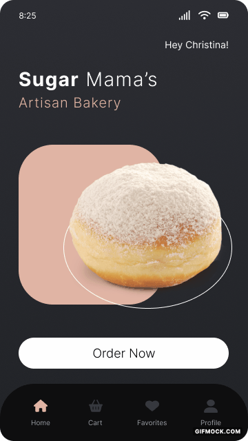
Sugar Mama's
UX DESIGN / VISUAL DESIGN
An e-commerce mobile
app for a local Ottawa bakery
* Developed as a part of the Google UX Design Professional certification

Challenge
Design a mobile application for a local Ottawa bakery that provides an exceptional user experience, increases customer satisfaction, and distinguishes the business as a frontrunner in the local market.
Solution
I created Sugar Mama's, an e-commerce mobile app that allows users, specifically busy professionals, to place orders for freshly baked goods with a focus on inclusivity and accessibility.
Tools
My Role
Timeline
Processes
- Figma
- Miro
- Sole UX Designer
- Date: Jul 2023 - Sept 2023
- Overall: 8 weeks
- Discovery & Research: 4 weeks
- Design & Testing: 4 weeks
- Secondary research and interviews
- Personas
- Userflow
- Wireframes
- Prototyping
- Visual design
Understanding the User
Research
I began by conducting foundational research utilizing a competitive audit and audit report. These helped me spot trends and identify openings in the market.
I then conducted five interviews via zoom with potential users and created affinity maps to better understand their needs. With this useful insight, I was able to lockdown three common pain points and establish the two types of users targeted by Sugar Mama's Bakery.
I then conducted five interviews via zoom with potential users and created affinity maps to better understand their needs. With this useful insight, I was able to lockdown three common pain points and establish the two types of users targeted by Sugar Mama's Bakery.
Painpoints
01
Group Orders
The user is overwhelmed and disorganized when collecting orders from members of the office.
02
Accessibility Barriers
The user is frustrated about having to ask for help when placing mobile orders, due to a visual impairment.
03
Time Constraints
The user is stressed about spending lots of time trying to complete an order with a busy work schedule.
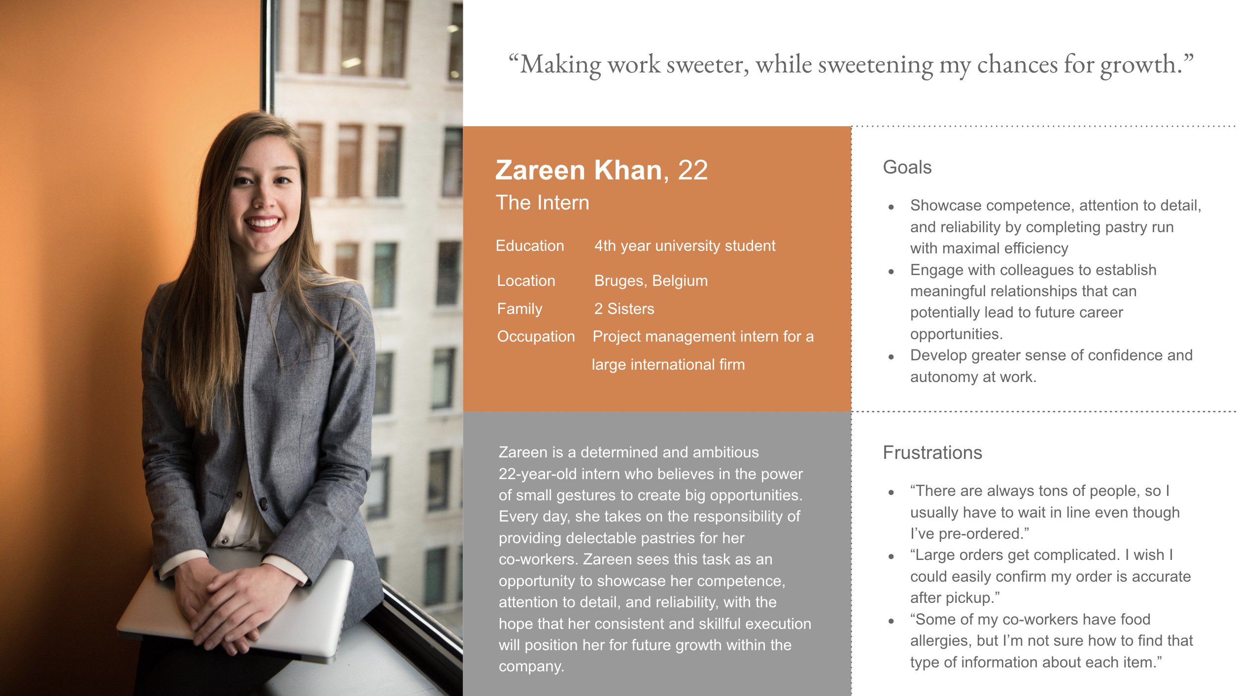
Personas
Persona 1: Zareen is a busy intern who needs a way to place group pastry orders for her office in a timely and efficient manner because if unsuccessful, she risks being perceived as incompetent and unreliable.
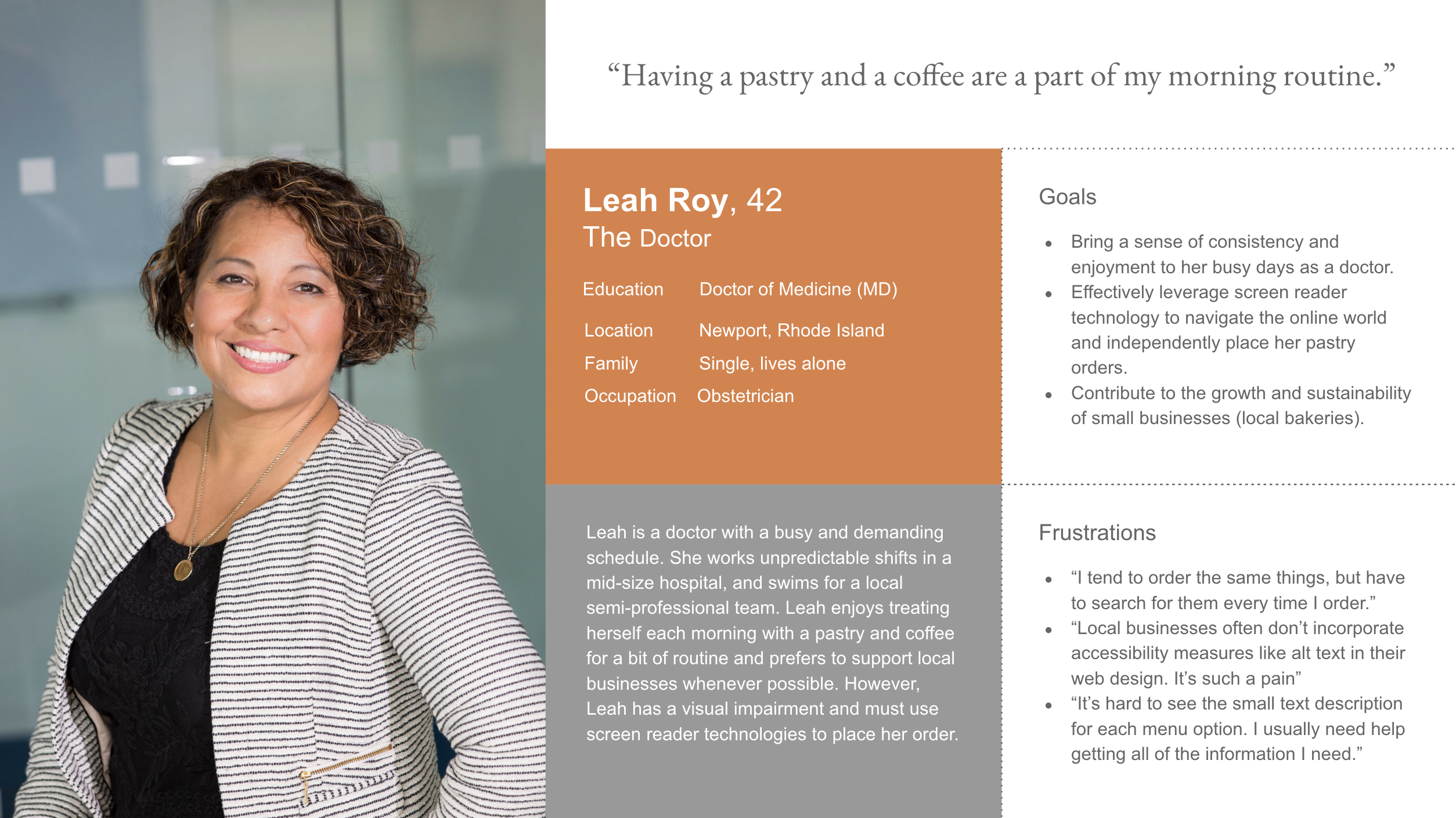
Persona 2: Leah is a visually impaired doctor who needs an accessible way to order from her local bakery because she struggles to read small text on phones and will have to ask for help otherwise.
Journey Maps
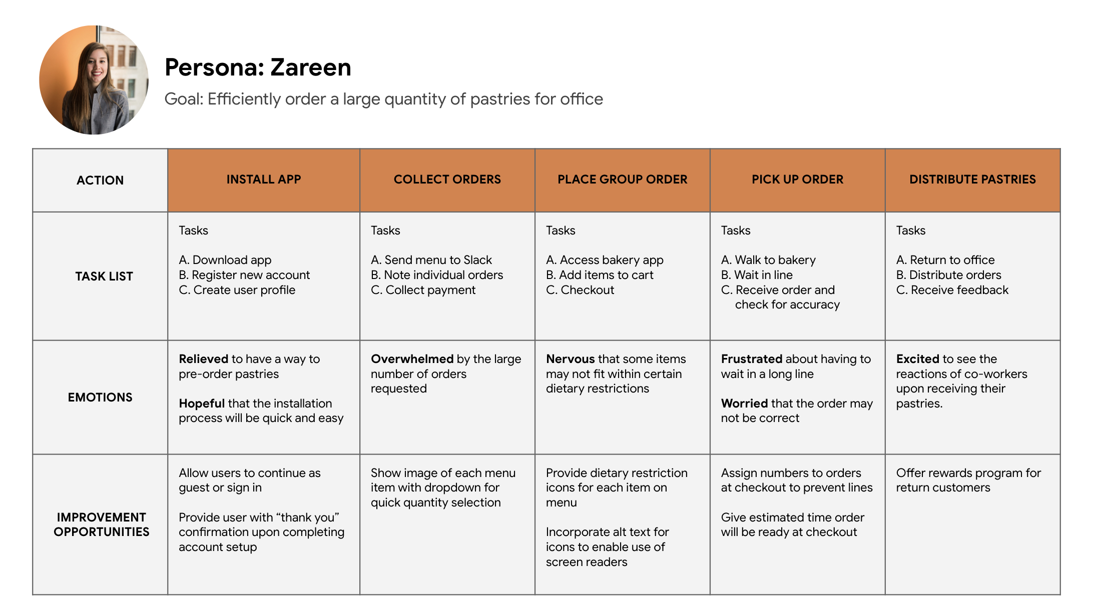
Mapping Zareen's journey revealed how helpful it would be for busy working professionals to have access to an app that makes placing group orders simple.
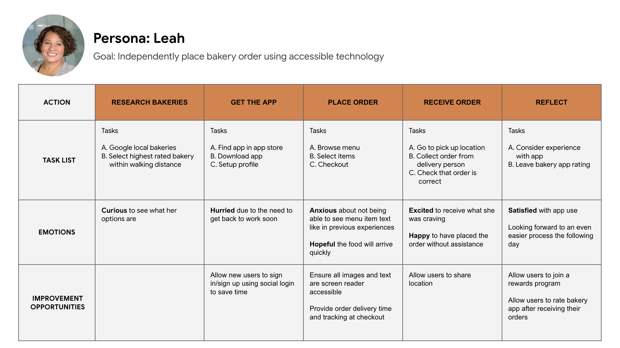
Leah's journey highlights the importance of accessibility features like alt-text and high-contrast font options to support users with vision impairments.
Starting the Design
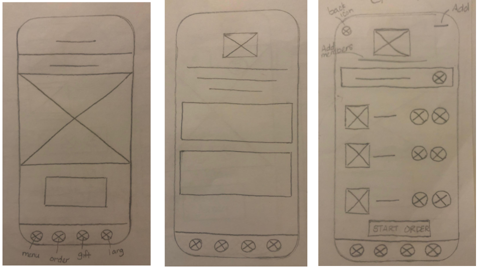
Paper Wireframes
I began the design process by sketching ideas drawn from secondary research and knowledge of the user's painpoints. The objective during this phase was rapid iteration of ideas as I explored design options that I felt would best meet the users' needs.
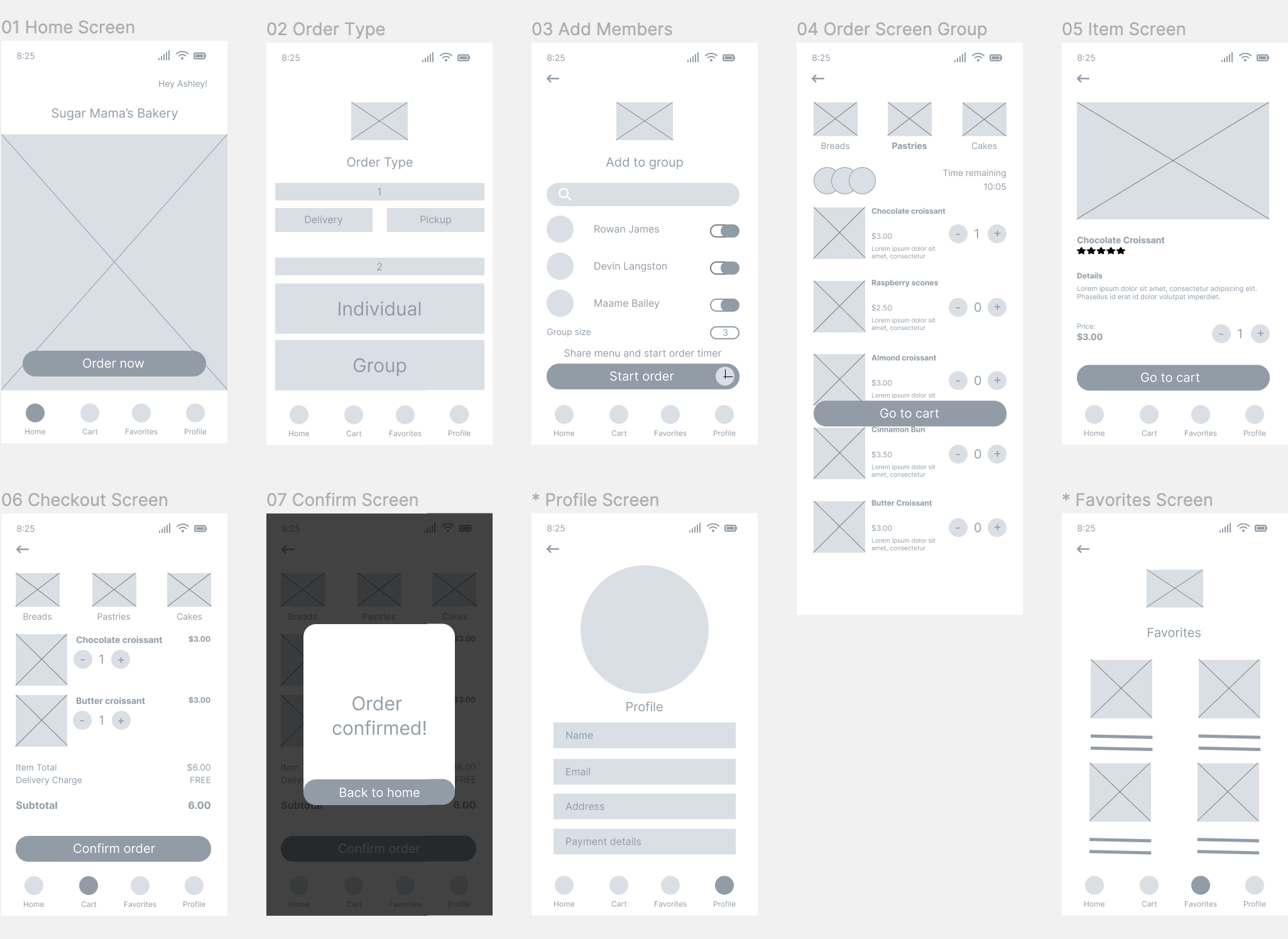
Digital Wireframes
Once I had decided on a specific set of screens to proceed with, I initiated the process of translating the designs into digital wireframes in Figma.
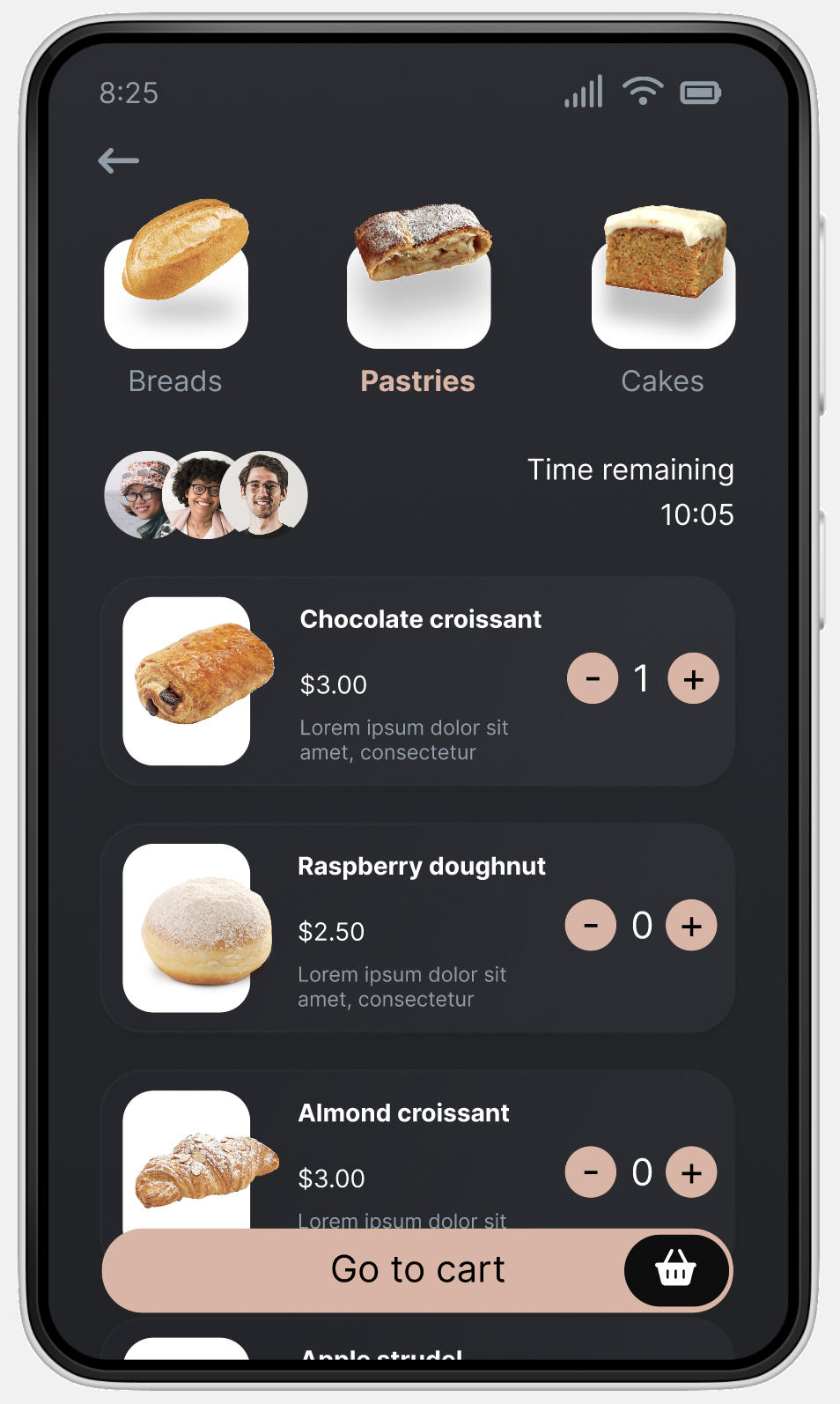
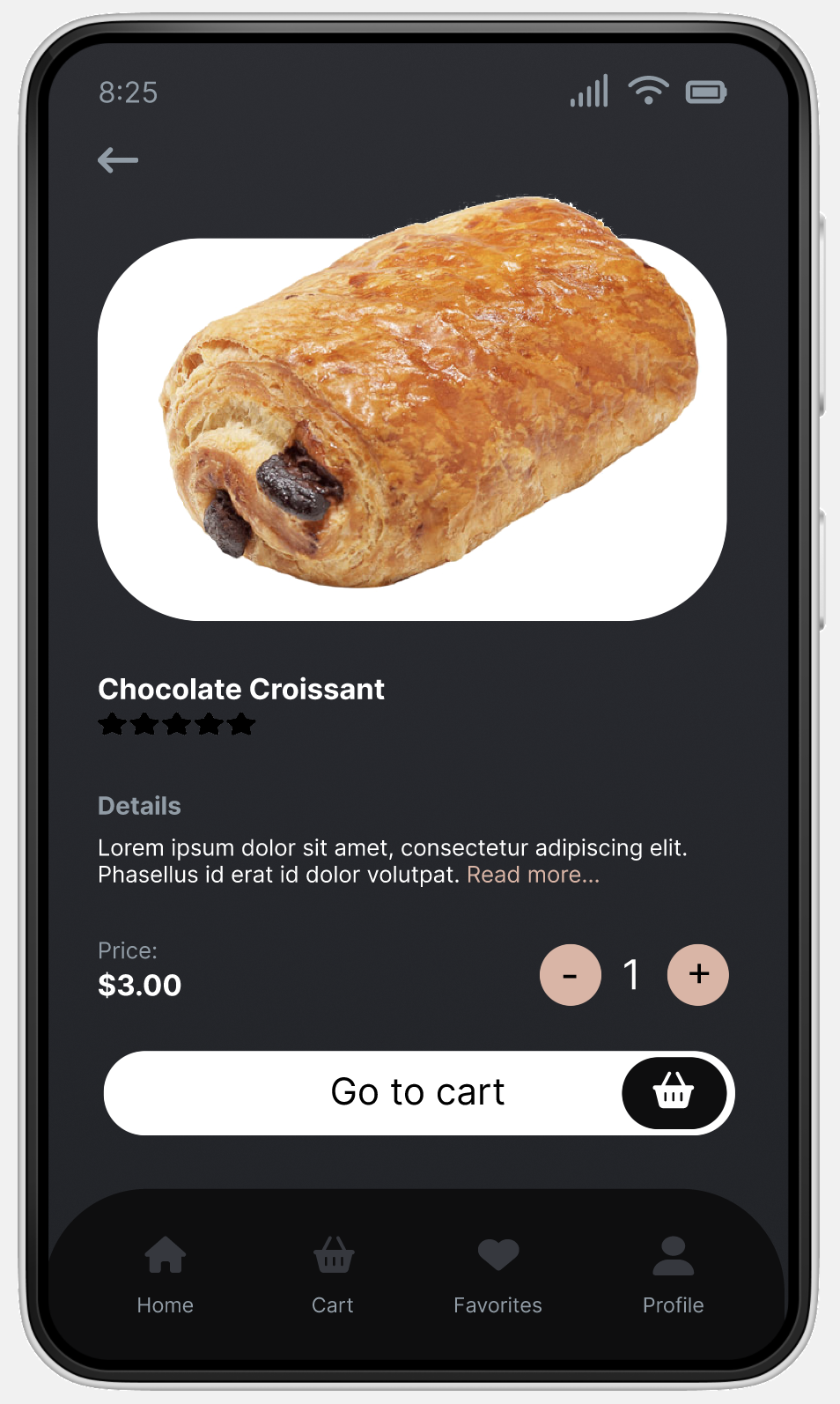
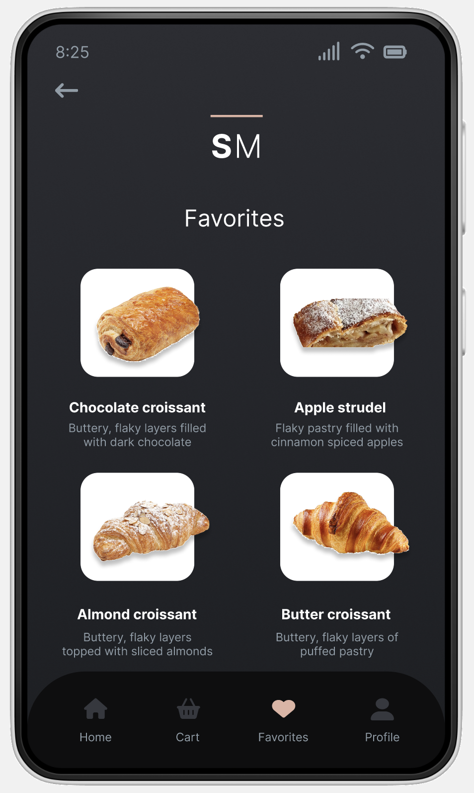
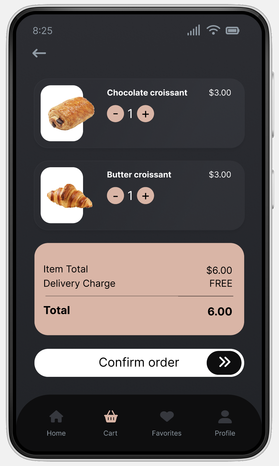
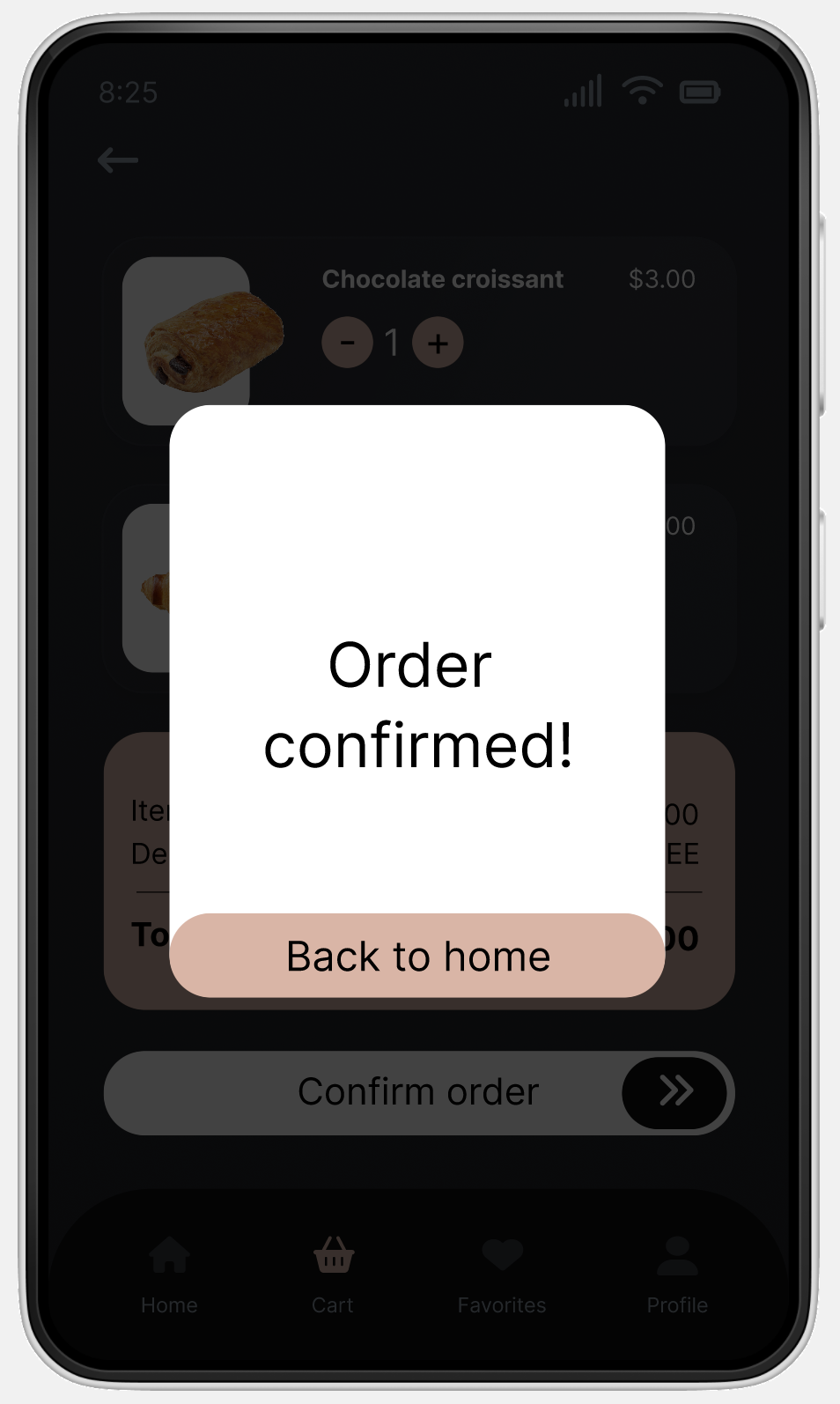
This series of screens shows the path a user will likely take to complete a group order:
This series of screens shows the path a user will likely take to complete a group order:
Low-fidelity Prototype
Using the initial digital wireframes, I created a lo-fi prototype to begin user testing. This prototype enables users to simulate the ordering process and easily navigate to essential screens like the profile and favorites.
The lo-fi prototype can be viewed in Figma.
The lo-fi prototype can be viewed in Figma.
.gif)
Usability Study Findings
I conducted a usability test utilizing my lo-fi prototype for early identification of any design flaws and to gain a better understanding of whether various aspects of the design such as the proposed group order feature resonates with users.
Round 1 findings
01
Users need better cues regarding the sequence of steps on the order type screen.
02
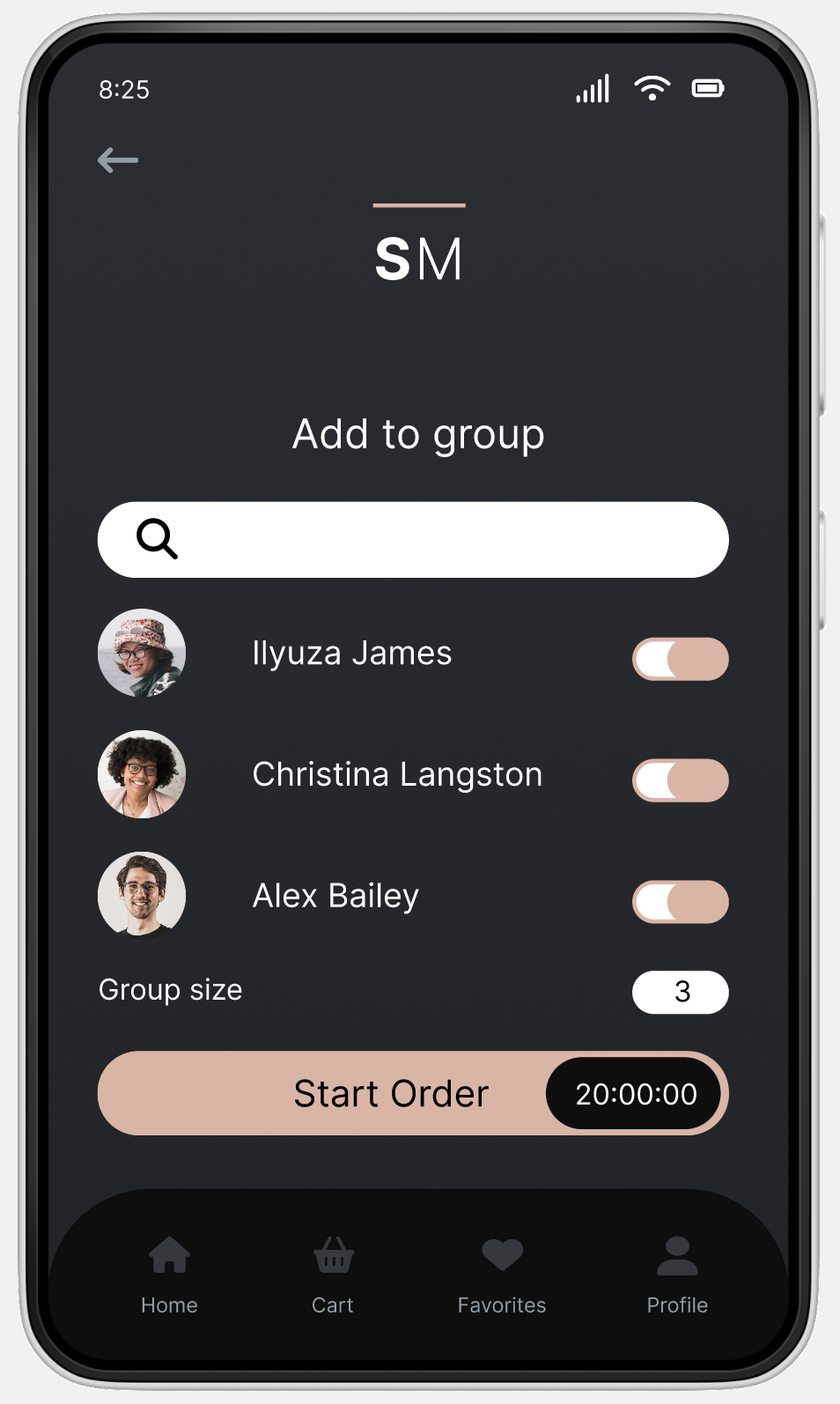
Users require more clear instructions on how to proceed when adding members to a group.
03
Users need to have the option to add items to their cart from multiple places in app.
Refining the Design
Mockups

Hi-fidelity Prototype
Key findings were extracted from the usability study, informing subsequent updates to the mockups. These changes included optimizing the checkout procedure and enhancing the clarity and user-friendliness of the order type screen. An updated prototype was then connected to reflect all of these modifications.
Explore the hi-fi prototype in Figma.
Explore the hi-fi prototype in Figma.
Accessibility Considerations
01
I added labels under the icons in the navigation menu to support the use of screen readers.
02
The app uses high color contrast, compliant with WCAG guidelines.
03
Alt text is provided for all images to support the use of screen readers.
Reflection
What I Learned
Through conceptualizing, testing, and refining Sugar Mama's mobile app, I acquired a significantly deeper comprehension of UX design procedures, underscored by the importance of prioritizing the user in every design choice.
Next Steps
I plan to conduct another round of usability studies to validate whether the painpoints users experienced have been effectively addressed.
Ashley.


Thanks for stopping by!
Receive updates on my latest interests, projects or any other thing I'm working on.
Subscribe to my newsletter